Creating the Visual Identity: From Sketches to Final Art
The distinctive visual style of Crazy Time Win didn't happen overnight. Our team went through numerous iterations to find the perfect balance of vibrant colors, quirky characters, and intuitive UI elements. This post takes you through our artistic journey from the first concept sketches to the polished visuals you see in the game today.
Finding Our Visual Voice
When we started working on Crazy Time Win, we knew we wanted a visual style that would instantly communicate the game's personality: fun, slightly chaotic, and bursting with energy. But defining that style took considerable exploration.
We began by creating mood boards that captured different potential directions:
- Minimalist and Clean: Focusing on simple geometric shapes with bold colors
- Cartoon Mayhem: Exaggerated characters with squash-and-stretch animation principles
- Pop Art Inspired: Bright colors with halftone patterns and bold outlines
- Retro Arcade: Pixel art with a modern twist
After presenting these options to our test players, we quickly discovered that the Cartoon Mayhem style resonated most strongly, particularly when combined with elements of Pop Art color theory. This gave us our foundation to build upon.
Character Development
The characters in Crazy Time Win needed to be instantly recognizable, even when moving quickly across the screen. We developed a set of design principles for all game elements:
- Clear silhouettes that read well at small sizes
- Distinctive color coding for different character types
- Exaggerated proportions to emphasize personality
- Simple but expressive facial features
- Smooth, bouncy animation that enhances the feeling of fun
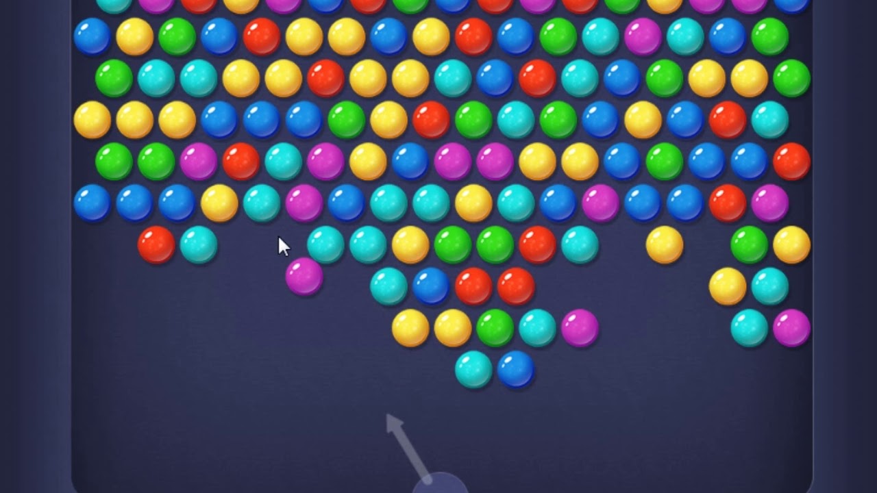
Evolution of our smile character design from early sketches to final version
One of our biggest breakthroughs came when we decided to make the characters' emotions part of the gameplay mechanics. The "Super-Smile" character, for instance, started as just another collectible but evolved into a central game element when we saw how players responded to its infectious grin.
Color Theory and Emotional Response
Colors in game design are more than aesthetic choices—they're communication tools. We developed a specific color language for Crazy Time Win:
- Yellows and Oranges: Primary colors for positive elements and rewards
- Blues: Used for time-related elements (the countdown clock, time bonuses)
- Greens: Indicate score multipliers and special power-ups
- Purples: Reserved for rare, high-value targets
- Reds: Used sparingly as accent colors and for obstacle warnings
This consistent color language helps players intuitively understand game elements even before they've read any instructions, making the learning curve much smoother.
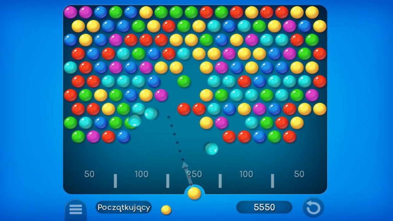
UI Design: Clarity Meets Personality
The user interface for a fast-paced game like Crazy Time Win needs to be both informative and unobtrusive. Our UI went through several iterations as we refined the balance between personality and functionality.
Early versions of our interface were too elaborate, with detailed frames and decorative elements that, while visually interesting, actually distracted from gameplay. Through user testing, we gradually simplified the design while maintaining character.
Key UI principles we established:
- Score information always visible but positioned to avoid interfering with the action
- Time remaining communicated both numerically and visually (through a shrinking bar)
- Minimalist button designs with clear hover and active states
- Consistent spacing and alignment throughout all screens
- Subtle animations for transitions between game states
Animation Philosophy
Movement brings a game to life, and for Crazy Time Win, we developed a specific animation philosophy that reinforces the game's energetic personality:
- Anticipation and follow-through on all character movements
- Slightly exaggerated physics for a more satisfying feel
- Micro-animations that reward player actions (buttons that pulse, targets that react before popping)
- Visual feedback that scales with achievement (bigger actions get bigger visual rewards)
One of our favorite animation details is how collected smiles briefly orbit the player's score before being absorbed—a small touch that makes each point feel more significant and satisfying.
Iterative Design Process
Creating the final look of Crazy Time Win involved countless iterations and refinements. We employed a rapid prototyping approach where art concepts were quickly implemented in-game for testing, rather than spending too much time perfecting concepts that might not work in practice.
This approach led to some surprising discoveries. For example, our initial background designs were far more detailed, with elaborate patterns and scenery. In playtests, however, we found that these busy backgrounds made it harder for players to focus on the interactive elements. The simpler, gradient-based backgrounds we ultimately chose actually allowed the characters and gameplay to shine.
Looking Forward
As we continue to expand Crazy Time Win with new features and seasonal content, our established visual language gives us a strong foundation to build upon. We're particularly excited about upcoming holiday themes that will introduce new color palettes while maintaining the game's distinctive personality.
In our next art-focused post, we'll dive deeper into our animation techniques and show how we create those satisfying pop effects that make the game so tactilely pleasing. Stay tuned!
